After dominating the news cycle for weeks, the debt ceiling issue is suddenly resolved and the bond market doesn’t seem to care. The jobs report proved to be far more relevant, but with half of it indicating a much stronger labor market and the other half saying the opposite, who’s telling the truth and why did rates only pay attention to the bad (good) news?
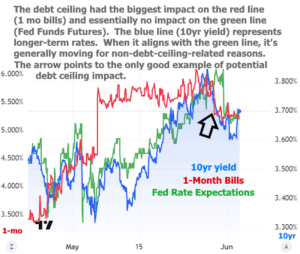
Let’s take one paragraph to put the debt ceiling to bed. Last week’s newsletter went into more detail on its relative unimportance–now confirmed by the absence of any major reaction after this week’s Senate passage (and imminent signing this weekend). The following chart is potentially confusing, but it attempts to show one line that only cares about non-debt-ceiling stuff (the green one), one line that cares a great deal about the debt ceiling (the red one), and finally, the blue line of 10yr yields to serve as a proxy for longerterm rates. Bottom line: if the blue line correlates more with the green line, the debt ceiling wasn’t a big deal for rates.
On to the jobs report! This month’s installment showed much stronger job creation with payroll counts at 339k and more than 90k of upward revisions to the last 2 months. Analysts were expecting less than 200k. Super strong!
This month’s installment also shows the unemployment rate ticking up to 3.7% from 3.4% last time, handily outpacing the 3.5% forecast. Occasionally, movement like that happens when the labor force participation rate changes, but it was perfectly steady this time. In other words, this is the opposite of super strong!
So who’s lying?
The first thing to understand about “the jobs report” is that it is comprised of two separate data collection efforts. One is a survey of regular old people that relies on individual responses (aka “household survey”). The other is a more formal, more systematized reporting of the number of payrolls at various employers (aka “establishment survey”).
The unemployment rate is derived from the household survey and nonfarm payrolls (NFP) comes from the establishment survey.
These two data collection efforts are absolutely massive. They are also highly regarded in terms of data integrity. In other words, the average investor has complete confidence that the Bureau of Labor Statistics is publishing the exact same data it collects.
Issues arise for a few reasons (sampling error, changes in seasonal adjustment factors, etc), but let’s focus on the simple issue of “noise.” Sure, NFP was much stronger, but it continues to trend lower.
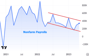
This trend is easier to visualize if we take a 12 month average of the blue line as seen in the chart below. While we’re at it, let’s look back into the pre-pandemic labor market to see a more stable baseline (note the incessant ups and downs in the payroll count from month to month, even while the orange line is flat):
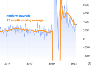
Zooming out also shows us that the jobs market is still finding its new normal after the lockdown shock of 2020. If you have ever wondered about the impact of the pandemic on the fabric of the labor market, we can simply adjust the y-axis to “show all” and remove all doubt (same lines as above, but charting the entire range):

But why did the bond market take the side of nonfarm payrolls (NFP)? In other words, why did rates move higher due to the job count instead of lower due to the uptick in unemployment (U/E)?
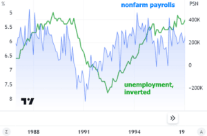
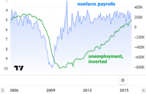
Simple! Market participants trust NFP much more than U/E to be a generally better early indicator of broad shifts in the labor market. Charts show why. Take the dot com recession as the first example of NFP clearly leading the way lower well before U/E. NFP bottomed almost 2 years earlier and peaked almost 3 years earlier on the other side of the recession.
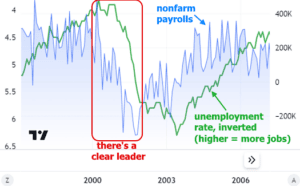
Similar patterns hold true for the adjacent economic cycles.
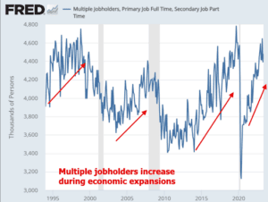
Are there other reasons that help explain the mixed messages? Could it be something other than “noise?” Perhaps an excess of multiple job holders inflated NFP (1 person with 2 jobs counts as 2 payrolls). And could this in turn mean the labor market is weaker than it seems? Probably not. The multiple jobholder category actually tends to rise when things are going well for the labor market, despite all the spin suggesting otherwise.
All that to say that the part of the jobs report that the market cares about was indeed worth some upward pressure on rates this week. Fortunately, the damage wasn’t excessive. In fact, rates ended the week noticeably lower than last week. It was only Friday that saw a moderate uptick.
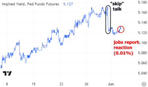
From here, the market’s focus will increasingly turn toward the upcoming Fed announcement on June 14th. Earlier this week, two separate Fed officials used the word “skip” to refer to the rate hike strategy. A skip is as good as a pause for financial markets, and a pause is the precursor to lower rates. The only question is how long we wait for that cycle to play out. The market reaction to the “skip talk” is most easily seen in Fed Funds Futures, which essentially allow investors to bet on Fed rate hikes/cuts. The chart equates to a lower chance of a rate hike on June 14th than seen last week.
