Ah, the joys of mortgage rates! If you’ve been scratching your head wondering why rates have been climbing higher after the Fed’s September 18th rate cut, you’re not alone. But here’s the thing—the Fed didn’t cause the recent rate rollercoaster. In fact, it wasn’t even the Fed’s fault that rates crept up toward the end of September. The Fed actually helped push rates down earlier this year, creating a little room to breathe before, well, rates decided to go their own way.
After the Fed cut, rates took a gentle upward stroll—until late last week. And then, just when we thought things might calm down, along came last Friday’s jobs report like a surprise party no one wanted, sending rates higher and higher. Cue the groans from all the low-rate enthusiasts out there. Let’s break it down visually:
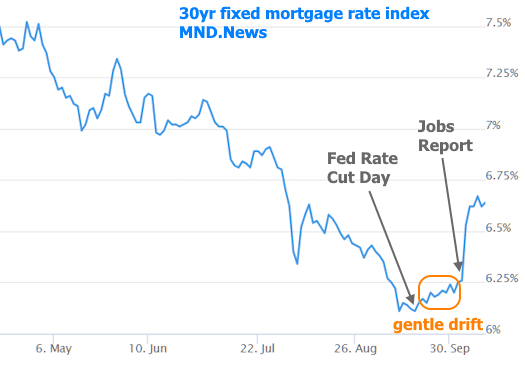
Neither the gentle rate creep nor the sudden spike was a huge shock. We’ve been waving our arms and shouting from the rooftops about the possibility of higher rates after the Fed cut. And then, bam! The jobs report came along, and instead of a surprise “we’re lowering rates” gift, we got the “higher rates” version. Everything else since then has been pretty tame. The real kicker? It’s going to take some serious economic data to shove rates back down, and for that, we’ll need a gloomy labor market. Fingers crossed for that, right?
Now, this week’s batch of economic data didn’t have enough oomph to make rates budge much. The Consumer Price Index (CPI), which used to be the star of the show, has taken on more of a supporting role. It’s important, sure, but it’s like the dependable sidekick—we’re just hoping it doesn’t stir up trouble by inching higher.
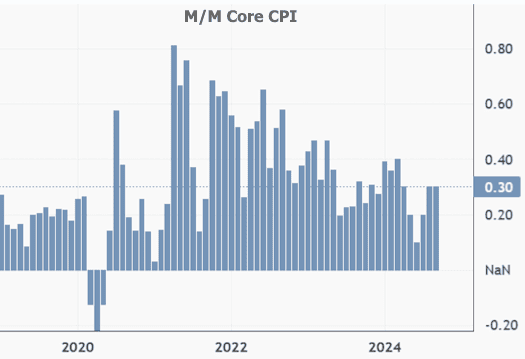
So what happened with the CPI this week? It came in a tad higher than expected. The monthly “core” reading hit 0.3 instead of the 0.2 that was forecast. If the Core CPI can’t cool down to 0.2 or 0.1 readings soon, the Fed might hesitate to keep cutting rates. Here’s a look at the data:
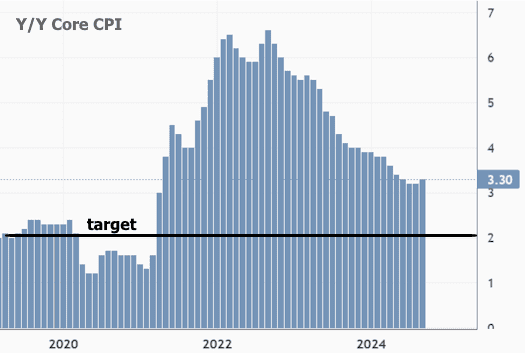
When we look at this data year over year, it becomes clear we’ve got a bit of a problem. If this week’s 0.3% core inflation keeps showing up month after month, we’re on track for a 3.6% annual inflation rate, which would be even higher than the current 3.3%. Oops.
Now, before you panic, there’s some good news. Initial Jobless Claims (the weekly report, not to be confused with the big jobs report) came in higher than expected. A surge in jobless claims can sometimes signal weakness in the labor market, which, oddly enough, can be a good thing for those hoping for lower mortgage rates. This week’s number was the highest since last summer and much higher than predicted.
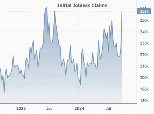
Sure, that might make you raise an eyebrow about the labor market, but hold on! There’s more. The chart itself shows a seasonal pattern, which we wouldn’t normally expect in seasonally adjusted data. However, if the usual labor market trends are shifting, it takes time for the adjustment models to catch up. To get around this, let’s look at the non-adjusted numbers compared to previous years:
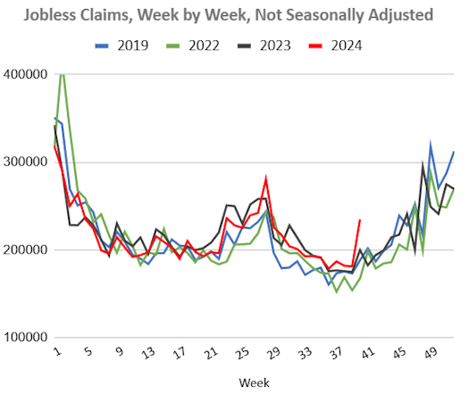
This chart shows a steeper spike in the red line compared to the others, which could signal more trouble in the labor market. If it weren’t for a few temporary disruptions like hurricanes, this might have caused a bigger stir. But for now, it’s being taken with a grain of salt. If that red line stays high over the coming weeks, though, we’ll be looking at a much bigger deal—and that could be a blessing for mortgage rates.
As for what’s ahead, next week’s going to be a short one for the rate market, with Monday off for Columbus / Indigenous Peoples’ Day. There isn’t much economic data to get excited about, so we might be waiting a few more weeks before seeing any big shifts.
